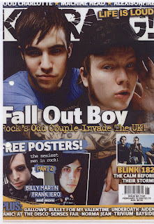
Kerrang Magazine was first published in 1981. It is a weekly magazine produced in the United Kingdom. It is published by Bauer, who also publish Q, another leading music magazine. The magazine mainly focus's on metal and rock music, although trends such as emo and metalcore, change the emphasis within the magazine from time to time. The name 'Kerrang' is an onomatopoeic. It refers to the sound made by playing a power cord on an electric guitar. The target gender is unclear. For example, the colour scheme, besides the writing, is quite dark and dreary, stereotypically male colour schemes. Where as some of the content, such as ''Free posters! the sexiest men in rock!'' is aimed at a more female audience.
The whole layout of the front cover, puts emphasis on the idea of the name. This is because everything looks as if it has been a bit shook up and discord-like. The main font used is sans serif. This is bold and emphasises all of the words. it has no 'feet' on the letters. Most of the writing is in white, except the title, which is in black and the words they want to emphasis, which is is yellow. Some of the words in yellow include: the tag line ''Life Is Loud'' and a tag on an article ''Part 2''. On the bottom of the magazine is the banner. This shows all the other names that will appear in the magazine. There is also the word 'plus' before the names showing that there is more in this magazine compared to the other ones on the shelf.
The main image on the page are the two band members from Fall Out Boy. Their image has been enlarged to cover about ⅔ of the page. The image has been cut from around their heads, so you Can see the name 'Kerrang' in the background. This shows their dominance with in the magazine. The lead sing of the band's head is in the centre of where the title looks as if its been smashed. Showing that he is likely to make the sound 'Kerrang'. The other images on the cover include pictures of the people who will be in the magazine. There are also no captions on the cover images. I think this helps to show a brand identity, and show that if you need to be told who these people are then maybe the magazine isn't for you.


